Exply empowers you with numerous chart types that fit your data perfectly.
Don’t just leave your business and project success to coincidence. The numerous chart types in Exply enable you to visualise & analyse your business and projects daily. Immediately gain useful insights into your performance and deduce valuable decisions concerning all projects and departments.
Make important decisions, based on data and facts, which generate the biggest success for your business. All chart types are an essential part of Exply and fully integrated.
Choose from numerous chart types:
- Raw Data Table
- Pivot Table
- Row Chart
- Bar Chart
- Time Series Charts
- Time Series Line Chart
- Time Series Area Chart
- Time Series Bar Chart
- Multivalue Time Series Chart
- Sunburst Pie Chart
- Scatter and Bubble Chart
- Gantt chart
- Correlation Matrix
- Treemap Chart
- Quota Tile
- Metric Tile (Counter Gadget)
- Burndown Chart
...and more coming soon:
- Map Chart
- Gauge Chart
- Progress Widget
- Funnel Diagram
- Histogram
Customize each charting widget individually. Define size, select by which values you want to stack your charts, how many values you want to show and so on. We are working hard to bring you even more chart types and visualizations in future updates of Exply.
Host Exply on Your Own Server

Row Chart
Create detailed analytics to compare your data for a certain timespan, project, task and more. Choose whether you would like to stack more information within each bar and how many stacks and bars to see.
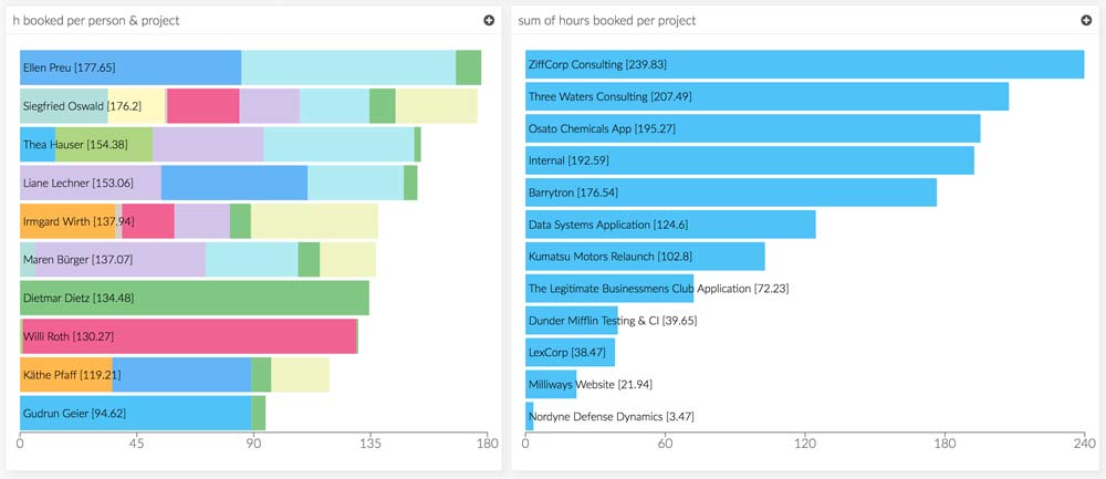

Bar Chart
The sibling of the Row Chart is the Bar Chart. Depending on which option you like the most, we got you covered.
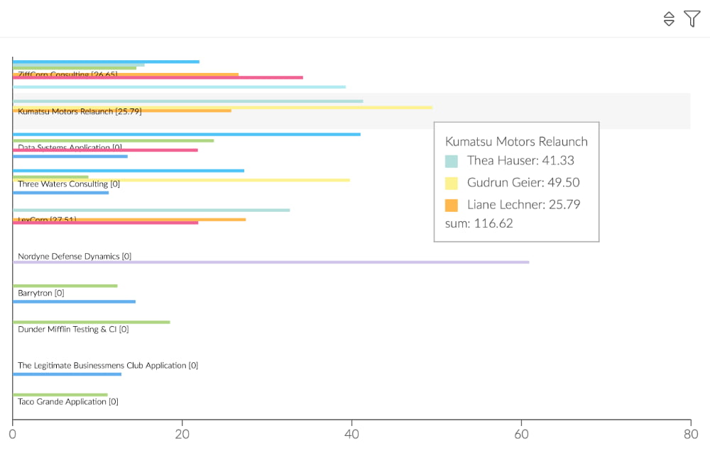
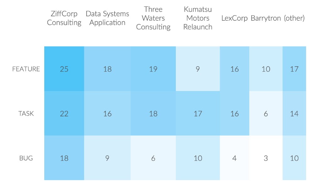
Pivot Row Chart
Row Charts provide you with a stacking so that you can pivot over an additional category. Pivot Row Charts allow you to display all values side by side.

Pivot Bar Chart
The sibling of the Pivot Row Chart is the Pivot Bar Chart. It also displays all values side by side, but in bars. Depending on which option you like the most, we got you covered.
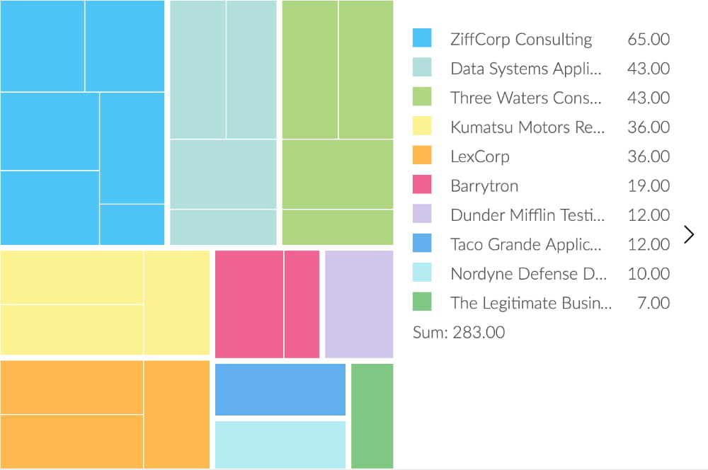
Treemap Chart
Treemaps are used to display hierarchical data. If the color and size dimensions correlate in some way with the tree structure, patterns often become obvious that would be difficult to see in other visualizations. For example, it becomes visible whether a certain color is particularly relevant.

Sunburst Pie Chart
Analogous to the Treemap Widget, the Sunburst Pie Chart displays hierarchical data. Each hierarchy is indicated by a ring, with the inner ring representing the top hierarchy. In sunburst diagrams you can see how the different hierarchy levels relate to each other.
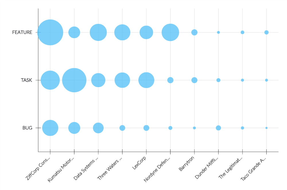
Scatter Plot
The Scatter Plot visualizes the correlation betweeen two categories. Each category is correlated with the other values in the table. This allows you to see which pairs have the highest correlation.
Correlation Matrix
The Correlation Matrix shows you the correlation betweeen two sets of variables. Each random variable in the table is correlated with each of the other values in the table. This allows you to see which pairs have the highest correlation.
Timeline Bars
The Timeline chart is used to visualize values and trends over time. Depending on the level of detail you want to see, you can stack additional information into the timeline bars (e.g. projects, team members, product groups, locations, etc.)


Timeline Area
The Timeline Areas Chart is used to represent trends over time. The time is always displayed on the x-axis and the key figures are displayed on the y-axis. The orientation cannot be changed to vertical.
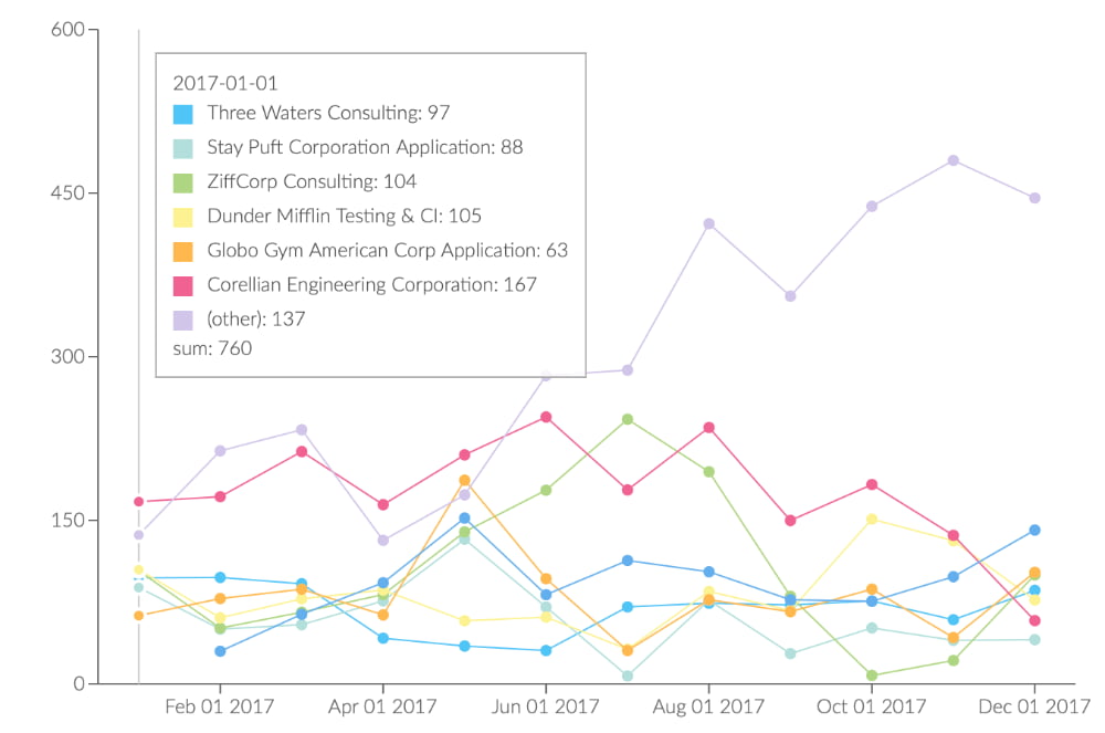
Timeline Lines
In difference to the Timeline Bars & Areas Charts, the Lines version doesn't stack the values. Timeseries data can therefore easily be compared.
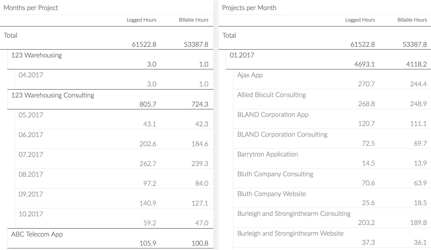
Pivot Tables
Pivot Tables allow you to analyze hierarchical data to get detailed insights stacked by projects, employees, tasks, issues and way more.
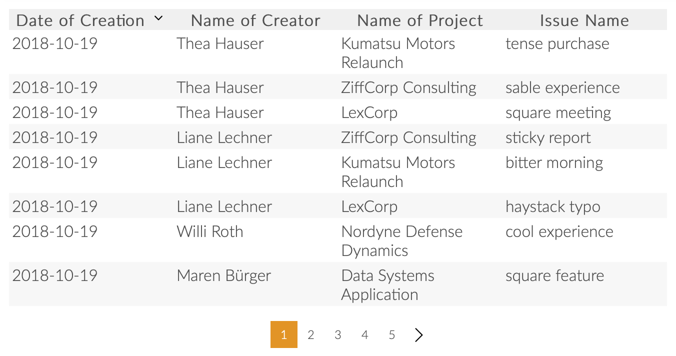
Results Table
Sometimes the simplest visualization is the best one. This absolutely fits the Results Table Widget and it's customizable columns and sorting.
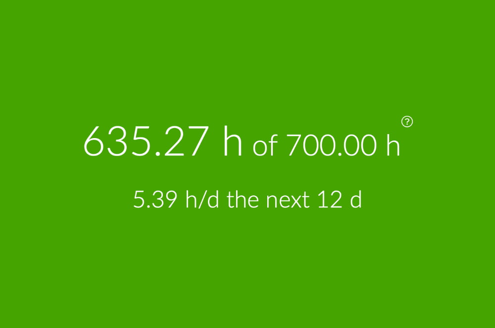
Quota Tile
Define individual budgets for several time spans, to perfectly monitor and manage your daily project time.
Metrics Tile
Directly show the sum, average, min, max or count of a any given value, e.g. logged hours, billable hours, hourly rate, issue solving time, revenue, sales and much more.

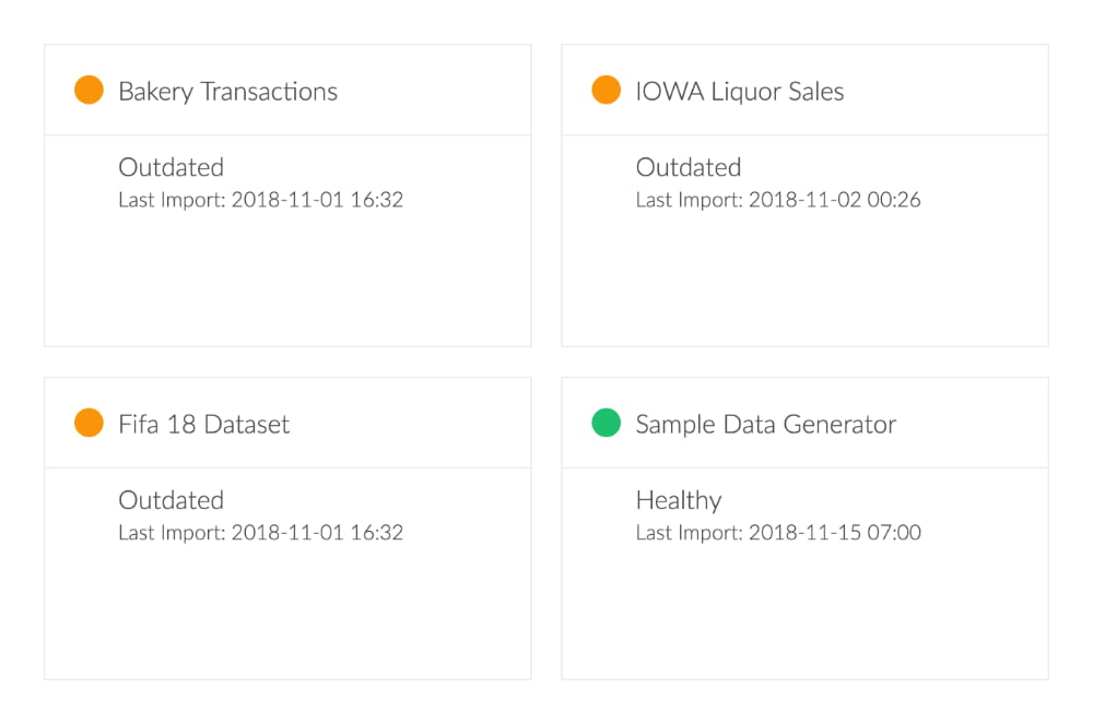
Importer Status
Data credibility is crucial for us. The Importer Status Widget instantly grants access to important information like last import, health status and lets you directly access the importer.
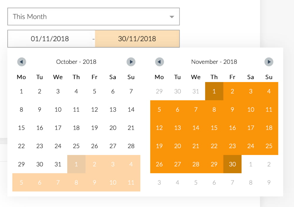
TimeSelector
The decentralized TimeSelector can be palced everywhere or even be deleted. You can use it to decide which days of the week are working days and which time span you want to be the default.

Logo / Image
One of the simplest widgets is the image. Place your customers logo in his dashboard to welcome him, or have a picture wall of all your team members, etc.
Your Advantages with Exply Chart Types
Direct Control
Control the success of your business and projects directly at your fingertips.
Peaks & Valleys
See peaks & valleys in performance and turn problems into opportunities.
Improved Planning
Continuously improve your planning by using comparable data from former projects.
Relevant Data
JIRA, Tempo Time Sheets, Git, JSON, CSV, XML - Integration of all relevant data sources and more.
Real-time KPIs
All charts are calculated in real-time giving you the best information possible.
Benchmarking
Compare projects, departments, etc. at the level you need to get to most relevant information.

Exply On-Premises
Requires Ubuntu 16, 18, Debian 9